Proxima Nova


Proxima Nova (2005) bridges the gap between typefaces like Futura and Akzidenz Grotesk. The result is a hybrid that combines modern proportions with a geometric appearance.
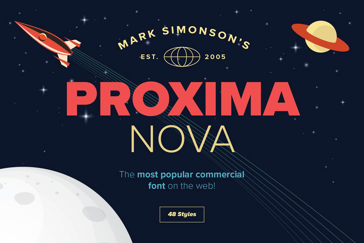
Mark Simonson originally released it in 1994 as Proxima Sans with a basic character set in three weights (Regular, Medium, and Black) with italics. He expanded the original six fonts into a full-featured and versatile family of 42 fonts (seven weights in three widths with italics).
VISIT MY PROFILE


